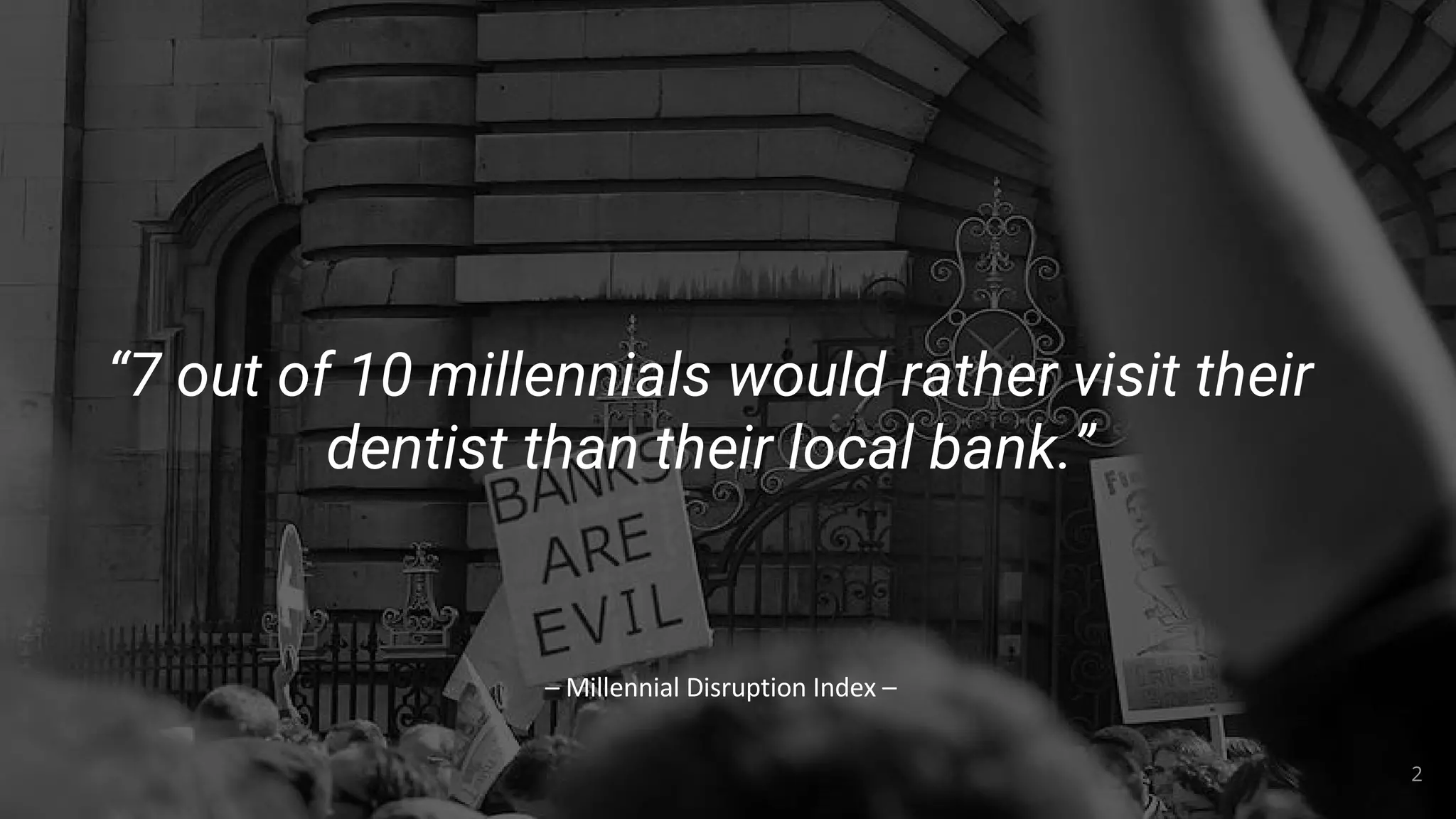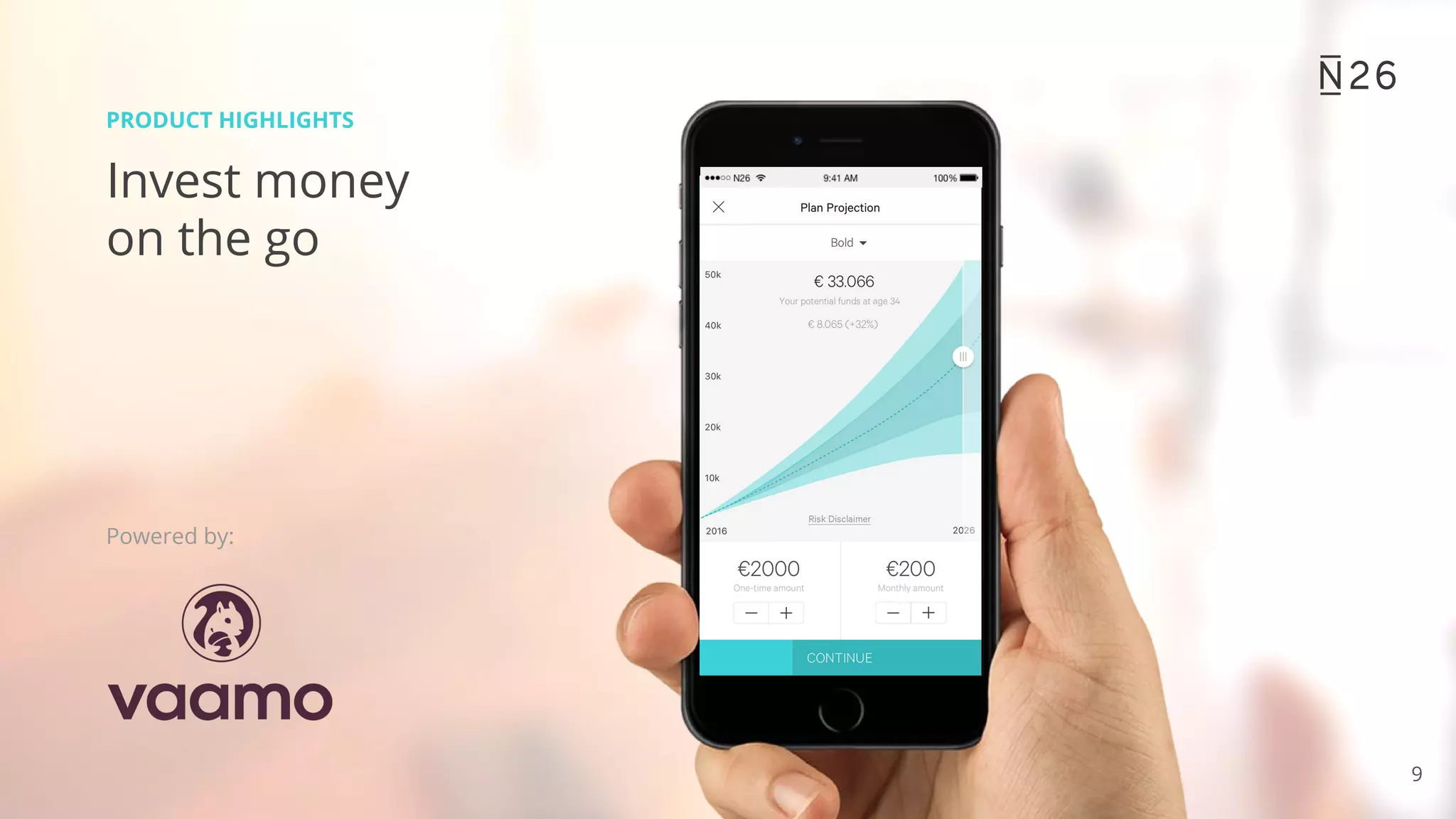
The Opening: Brand + Problem Framing
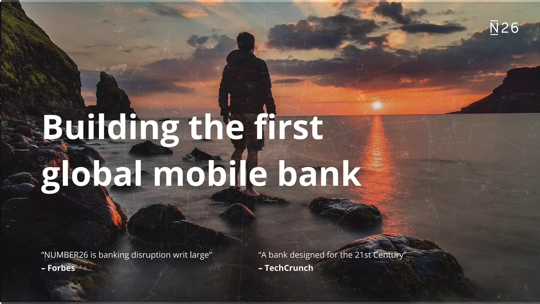
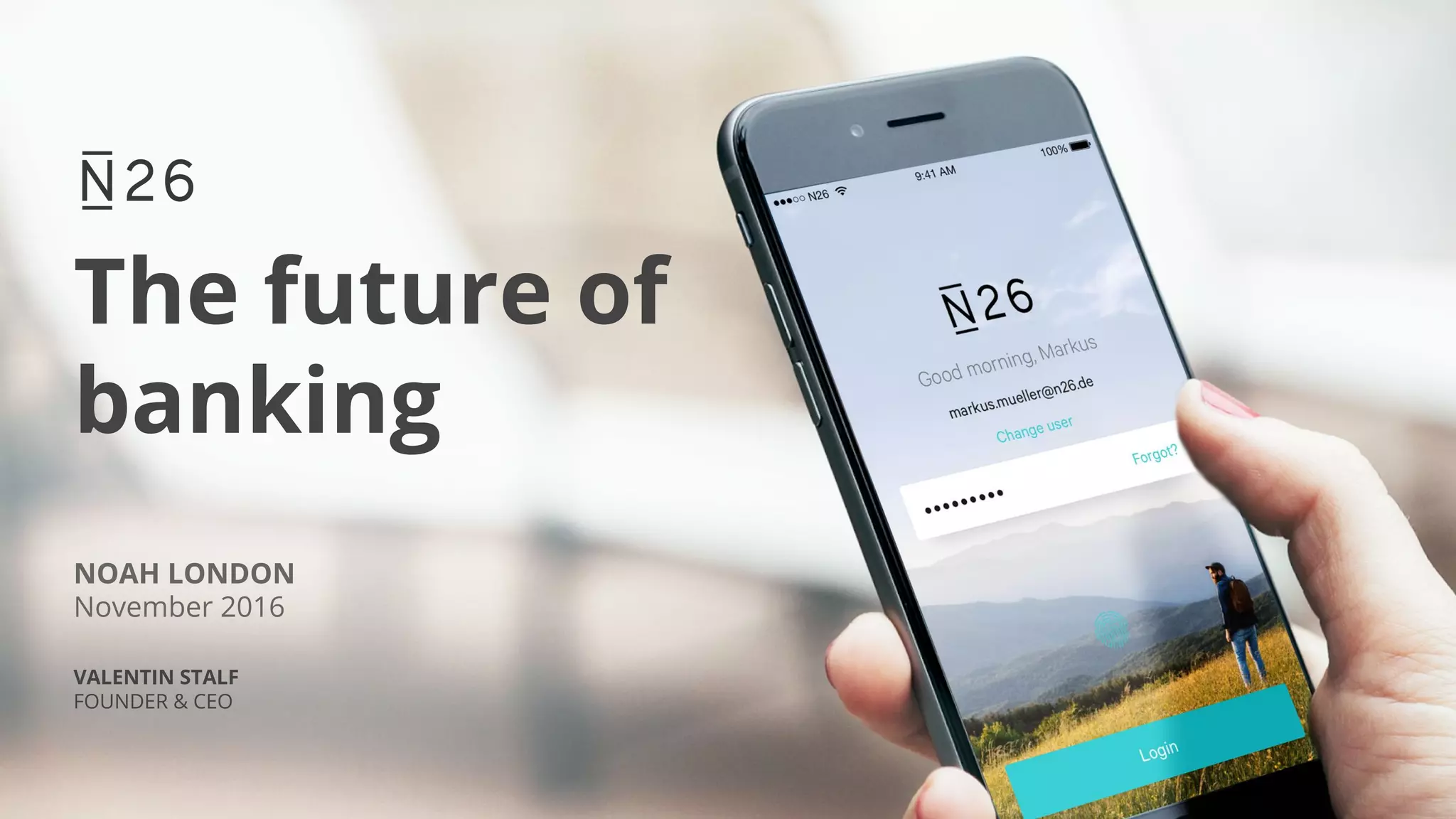
Slide 1 opens with a bold visual and a short, memorable tagline: "The future of banking." The hero image of the mobile login screen immediately communicates the product context (mobile-first banking) while the slide credits and date anchor the pitch historically. This slide is effective because it sets an emotional tone and communicates product-category fit in under five seconds — essential for investor attention in early deck review.
Founders can learn from the economy of this slide: lead with a strong visual that shows the product in-context, pair it with a single declarative line about the company mission, and include minimal logistical details (event, date, presenter) so the audience knows why they should keep watching. The slide signals confidence without overwhelming viewers with data, making it an ideal opener to segue into problem and traction slides.