Stack up against Instacart

Compare Your Deck

Instacart's 2013 Pitch Deck

Marketplace
Stage: Various
Raised: Multiple
Year: 2013
Slides: 20
Outcome: IPO at $10B valuation

Pitch Deck

1 / 20
Slide 1
Click to expand

Deck Analysis

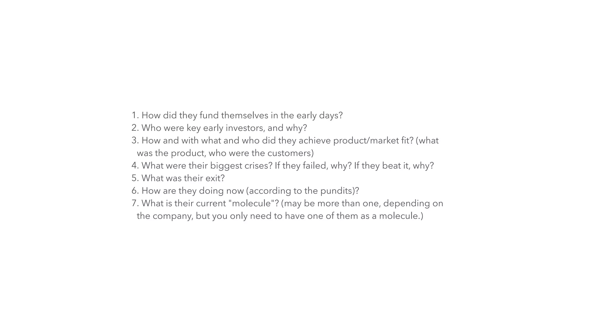
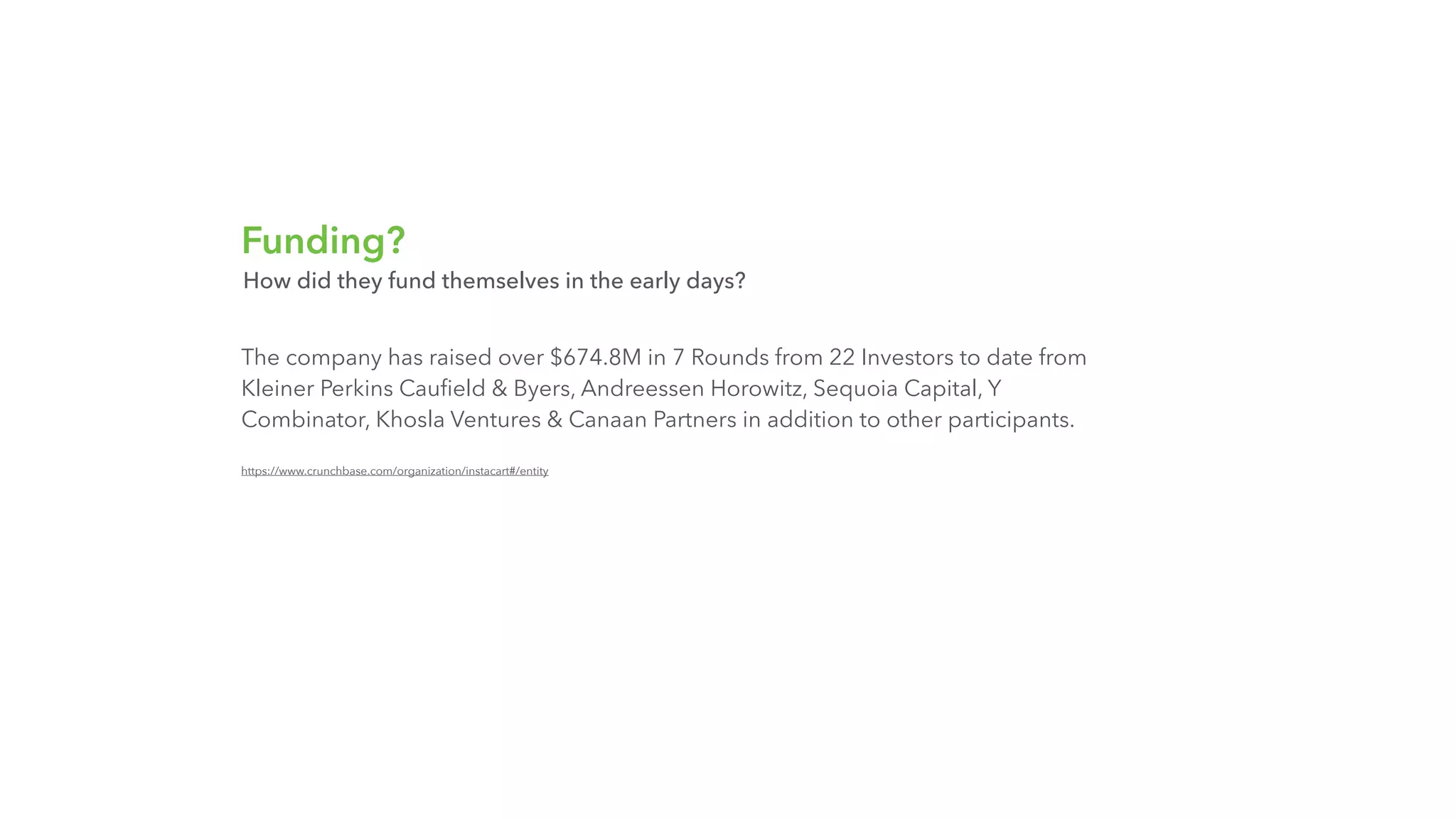
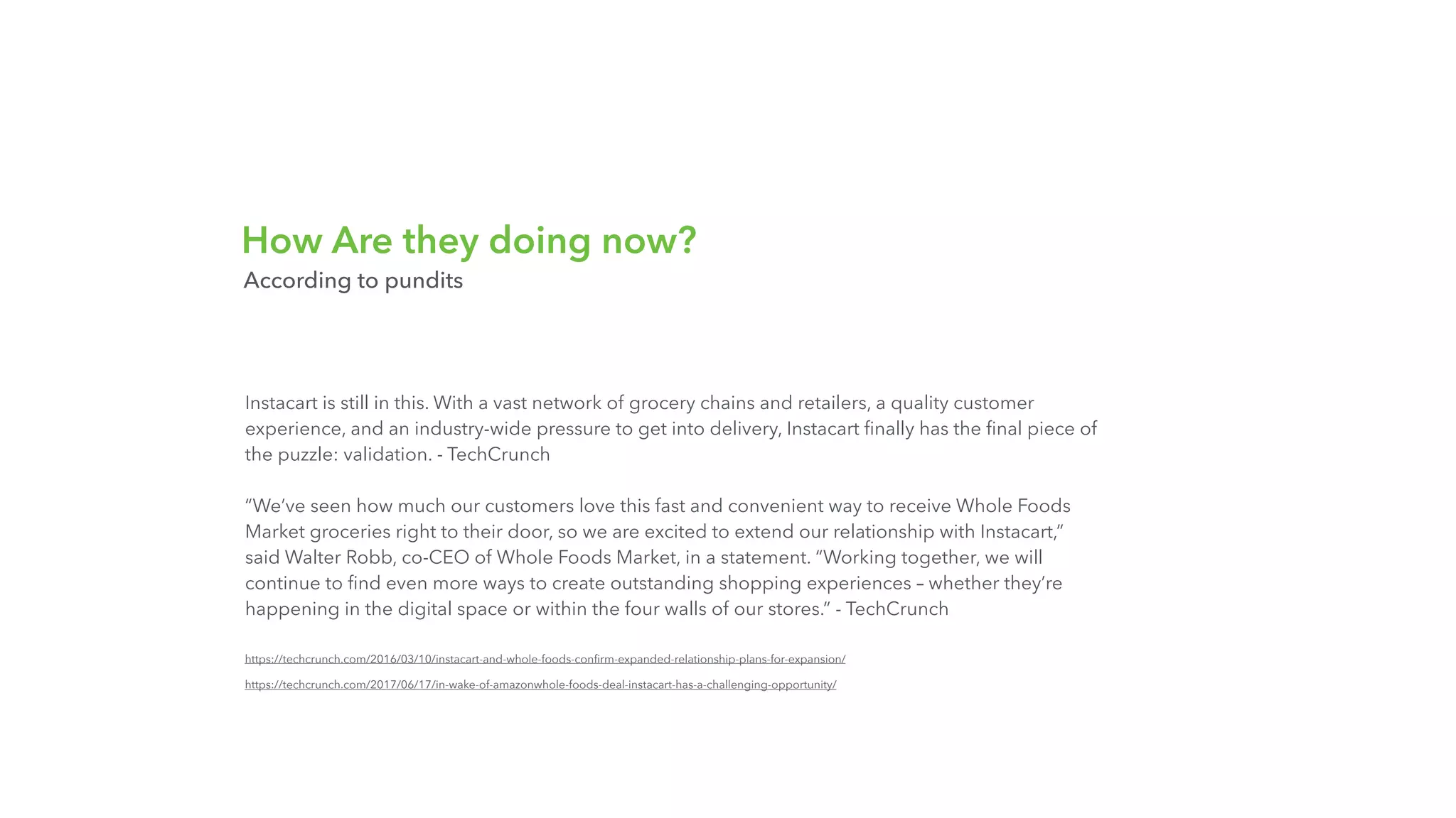
This deck summarizes Instacart's early story: a focused consumer marketplace that connected urban customers, freelance shoppers, and local stores to deliver groceries quickly. It combines crisp positioning, visual fundraising milestones, a clear articulation of users and operations, and candid discussion of operational crises and strategic partnerships. Notable is how the deck balances product messaging with investor-facing signals (funding timeline, lead backers) and operational detail that demonstrates the unit economics and feasibility of the marketplace model.

Opening: Brand and Signal

Opening: Brand and Signal

The first slide is a stripped-down title slide that combines the Instacart logo with the subtitle 'Lessons From The Past'. Its minimalism underscores brand recognition and sets a retrospective, learning-focused tone. For investors and partners who already know the company, this approach signals confidence and avoids wasting real estate on obvious background.

Key Takeaway: Open with a strong, recognizable brand mark and a concise framing line to set tone and credibility immediately.
Product: Clear Value Proposition and Low-friction Signup

Product: Clear Value Proposition and Low-friction Signup

The product screenshot (home/landing) doubles as a one-line value prop: 'Groceries delivered in an hour.' That single sentence instantaneously communicates the core customer benefit and the service's differentiator. The page also centers very simple CTAs (social sign-in and email sign-up) and places them above the fold on a visually rich background, making the conversion path obvious and friction-minimized.
The use of social login as a primary CTA shows consumer-focused product thinking: remove signup friction and increase acquisition velocity. Founders can learn the importance of front-loading the core promise, making the action obvious, and using strong visuals that reinforce product category and quality (fresh produce in this case).

Key Takeaway: Lead with a single, benefit-driven sentence and make the signup path extremely low-friction to convert first-time visitors.
Fundraising Timeline: Milestones and Momentum

Fundraising Timeline: Milestones and Momentum

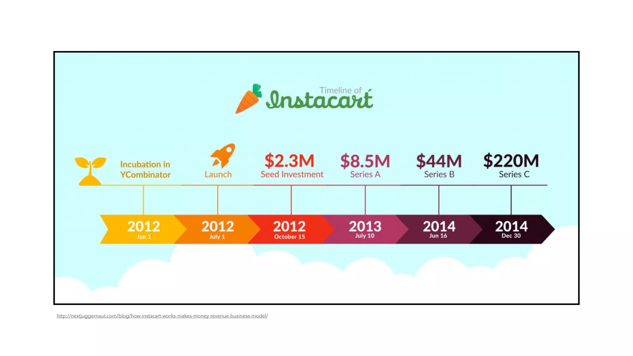
The timeline slide visualizes early milestones and the cadence of funding rounds. It compresses complex fundraising history into an easily digestible graphic showing incubator involvement, launch, seed, and successive series raises. Visual timelines do double duty: they tell a narrative of momentum and make it easy for later-stage investors to understand how capital was deployed over time.
Founders should note how the slide frames credibility through both dates and amounts; the visual reinforces rapid progress and helps justify valuation and future capital asks. For presentation decks, a clear timeline replaces verbose spreadsheets and gives context for growth claims.

Key Takeaway: Use a compact timeline to show fundraising and operational milestones so investors can quickly grasp your tempo and credibility.
Investor and Round Details: Transparency About Backers

Investor and Round Details: Transparency About Backers

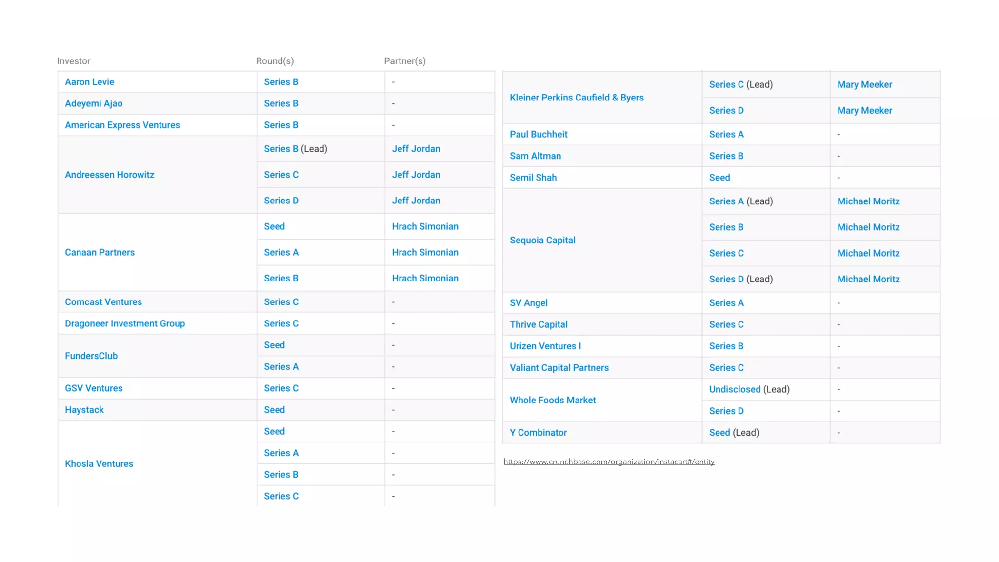
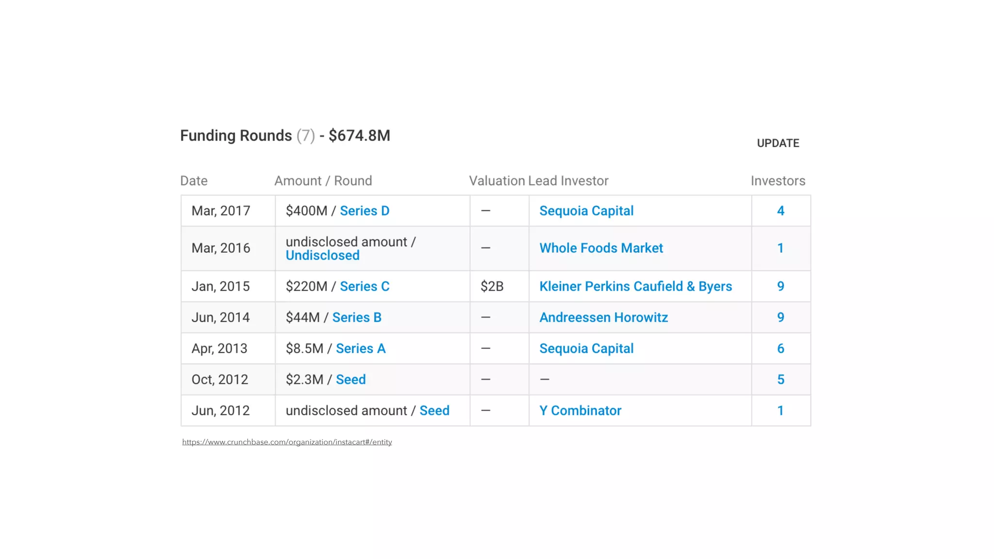
The funding rounds table lists dates, amounts, lead investors, and round types, which communicates institutional validation and the escalation of outside belief. Showing recognizable lead investors and large round sizes signals to readers that the company achieved repeatable conviction from top-tier firms. This is especially important for marketplace businesses that require substantial capital to scale supply-side liquidity and geographic expansion.
The lesson for founders is to clearly document investor pedigree and round details in investor-facing materials; it helps new potential partners understand cap table dynamics, leverage, and the quality of due diligence already performed. Transparency about rounds also reduces questions and builds trust, particularly when there are complex or undisclosed amounts involved.

Key Takeaway: List round dates, amounts, and lead investors to communicate institutional validation and make fundraising history easy to verify.
Product-Market Fit: Three-sided Marketplace Focus

Product-Market Fit: Three-sided Marketplace Focus

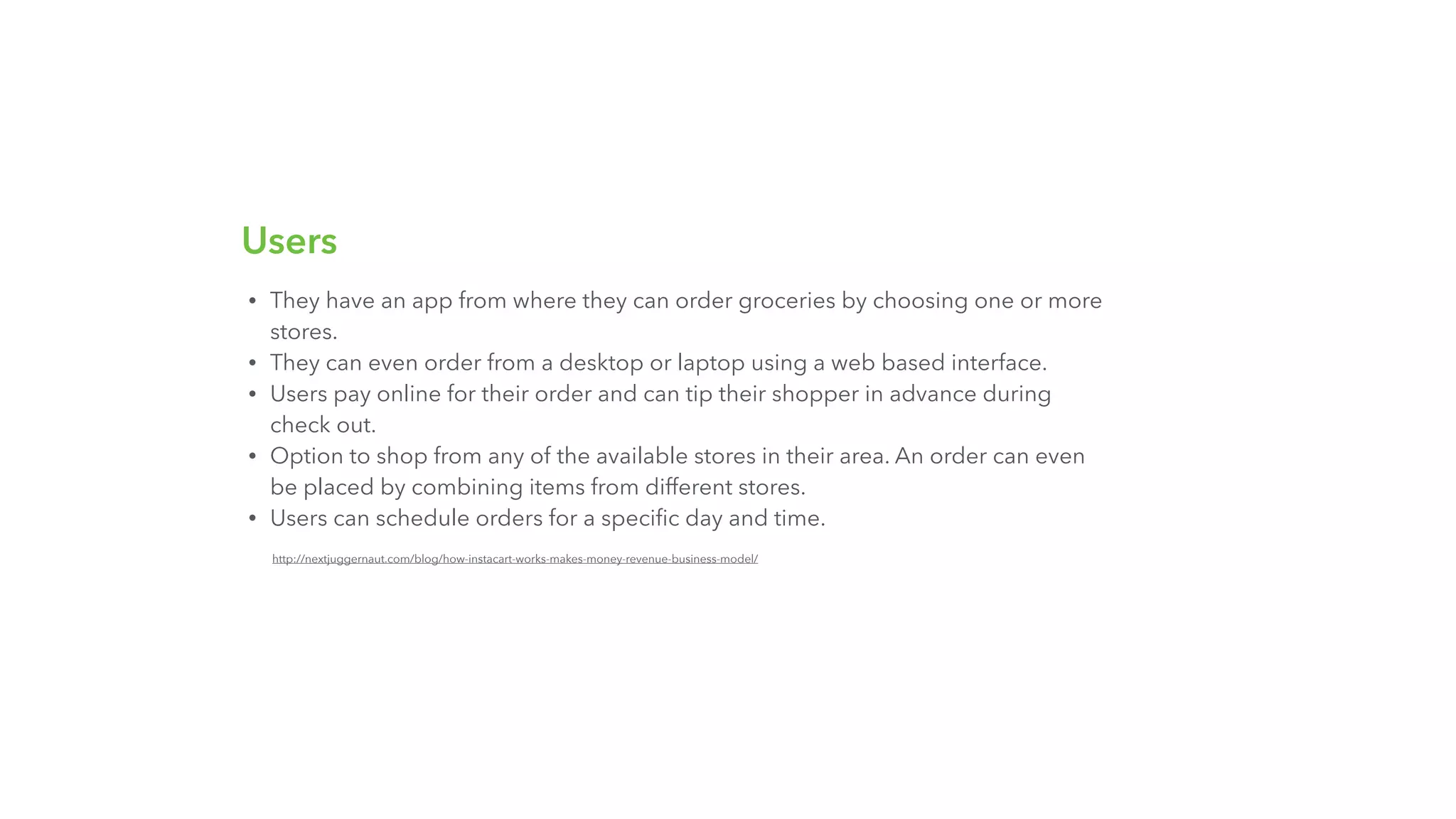
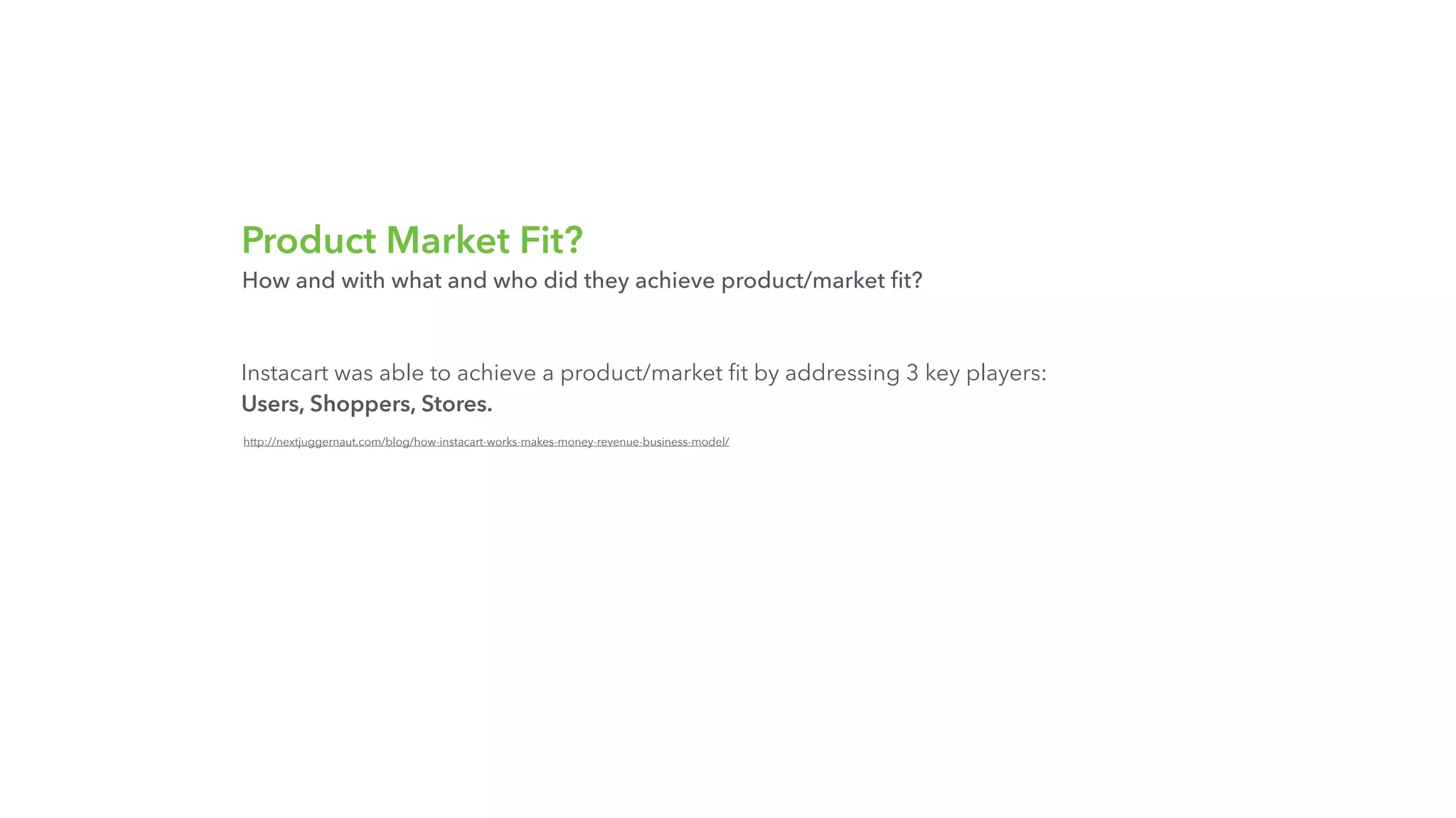
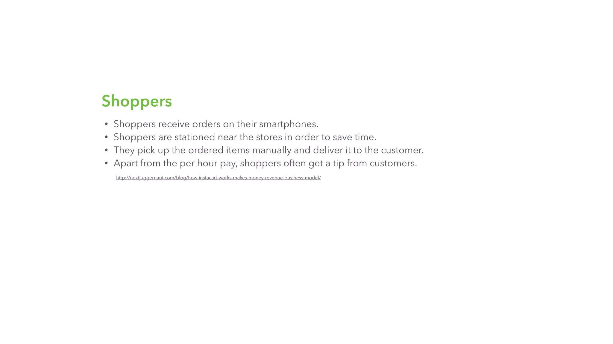
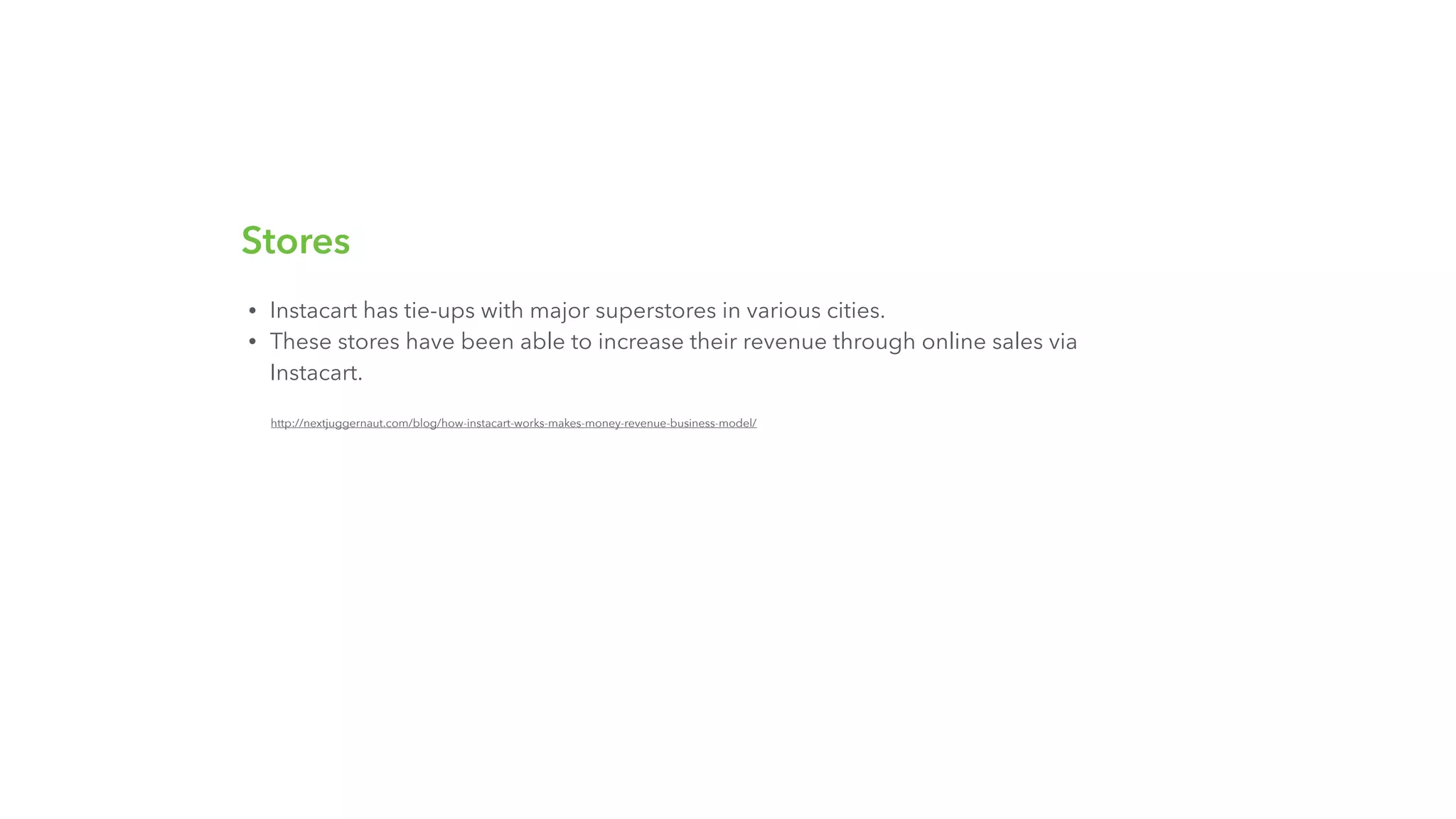
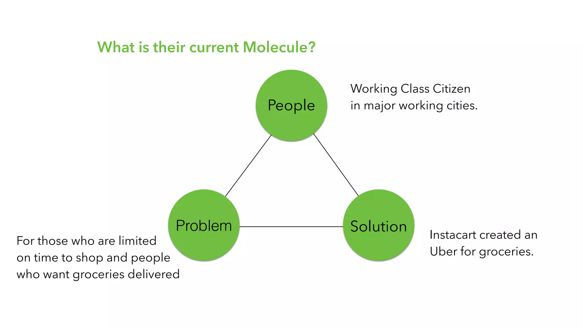
A set of slides explains how Instacart achieved product-market fit by explicitly addressing three players: users, shoppers, and stores. The deck breaks each group's experience down into practical features and operational design choices (mobile ordering, scheduling, shopper payment and tips, in-store partnerships). This three-sided clarity shows the founders understood the interdependent incentives that make a marketplace sticky and operationally possible.
For founders building two- or three-sided marketplaces, the takeaway is to articulate each stakeholder's value proposition and the mechanisms that balance supply and demand. Practical details (e.g., shoppers stationed near stores, tip options) show how product design solves real friction points and should be highlighted to demonstrate operational maturity.

Key Takeaway: Explicitly map each marketplace participant and show concrete product features or operational decisions that solve their core problems.
Business Model: Visualizing Revenue and Costs

Business Model: Visualizing Revenue and Costs

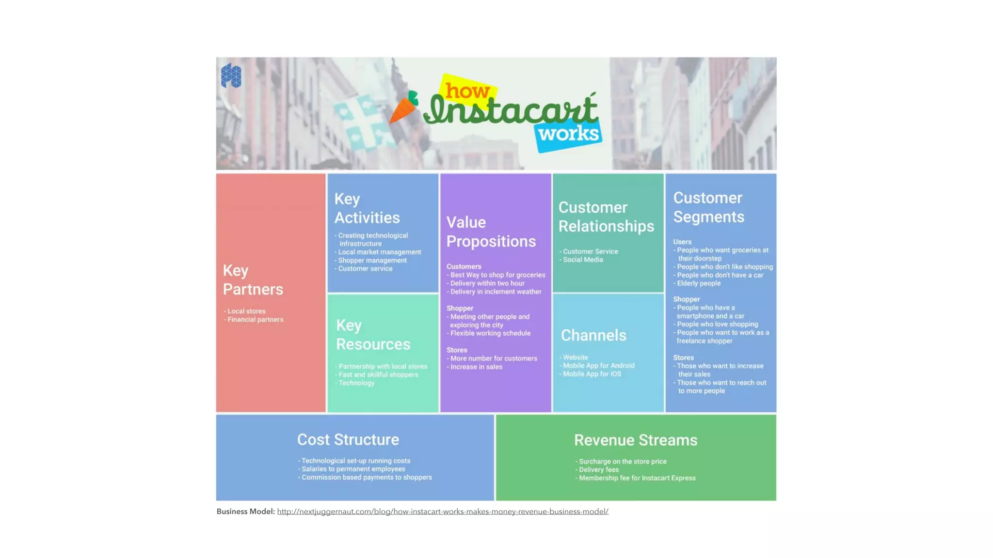
The business model canvas slide succinctly lays out key partners, activities, resources, channels, cost structure, and revenue streams. Presenting this information visually makes the unit economics and monetization levers easier to follow: surcharges, delivery fees, membership, and partnerships. The canvas also points to where costs concentrate (technology and worker pay) and where leverage can be gained (partnerships with stores).
Founders should emulate the use of a one-page visual to show how the business actually makes money and where scale effects will appear. Investors want to see clear revenue streams and the levers you will pull to improve margins—this canvas format communicates that efficiently.

Key Takeaway: Use a single visual to tie together partners, cost structure, and specific revenue streams so investors see how scale translates to economics.
Operational Crises and Strategic Responses

Operational Crises and Strategic Responses

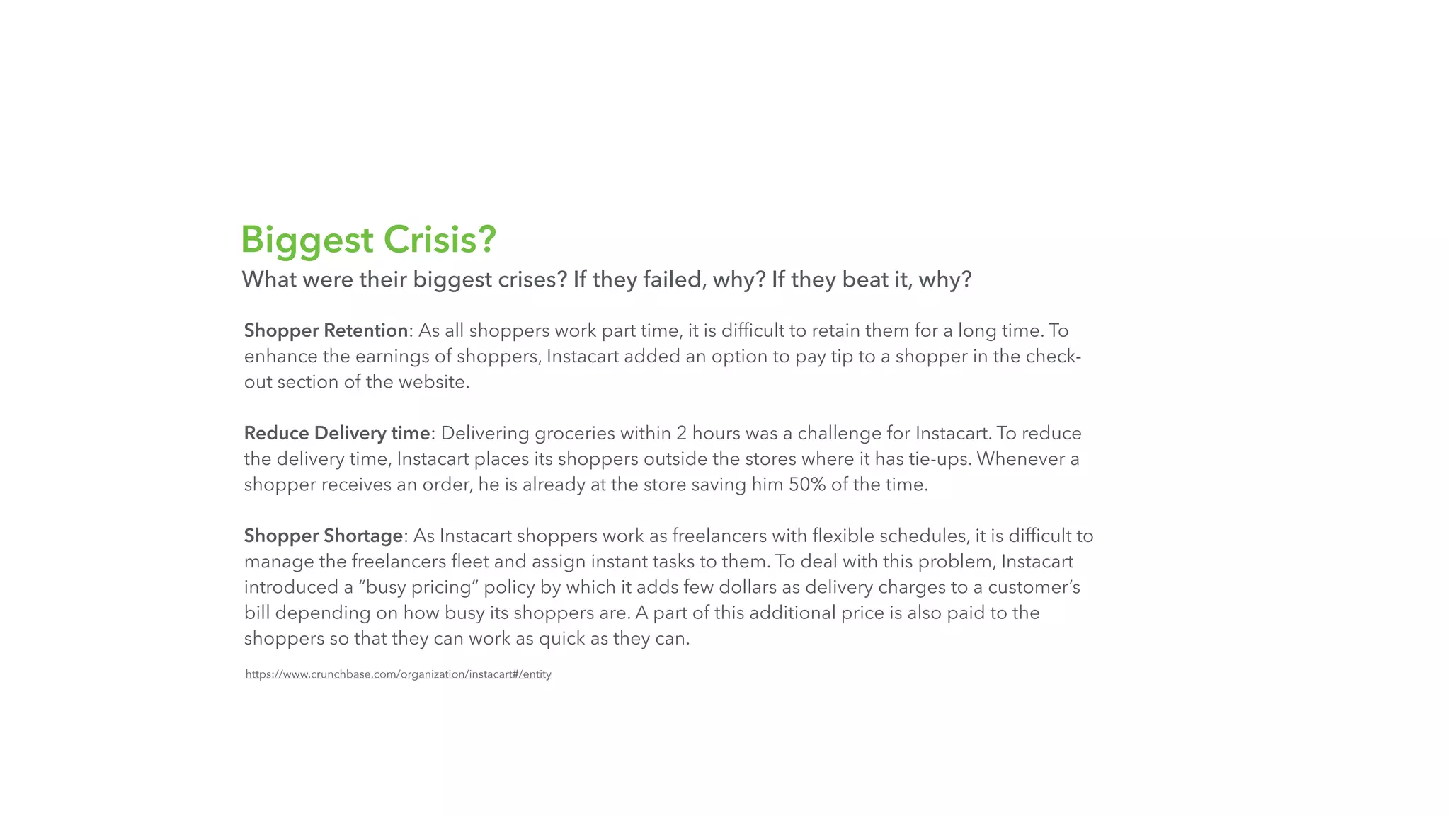
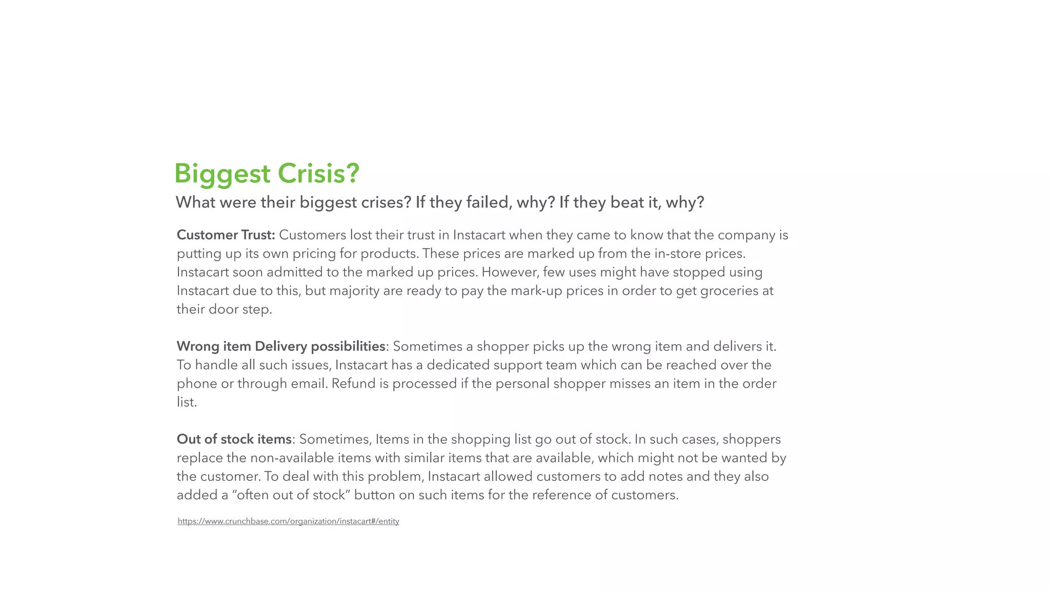
The deck candidly lists major operational challenges—shopper retention, delivery times, pricing during busy periods, customer trust with pricing/markups, wrong item deliveries, and out-of-stock handling—and the tactical responses used to mitigate them. This candor is powerful because it demonstrates that the team not only recognizes risk but has tested and implemented mitigations, such as tips and busy-pricing to incentivize shoppers, stationing shoppers near stores to cut delivery time, and adding customer support and refund policies for errors.
Including problems and their fixes in a pitch signals maturity and reduces investor anxiety about execution risk. Founders should call out the top 3–5 operational risks and present specific, tested fixes rather than vague assurances, which turns potential weaknesses into evidence of learning and resilience.

Key Takeaway: Highlight your top operational risks and the concrete, tested responses you implemented to reduce investor concern and show executional competence.

Conclusion: Key Lessons

This deck balances brand, product clarity, investor evidence, operational detail, and honesty about crises. Its strengths are a one-line value proposition, simple conversion-focused product presentation, a clear fundraising timeline with reputable backers, a concise business model canvas, and explicit documentation of operational challenges plus fixes. These elements together demonstrate product-market fit and execution capability—critical signals for investors in capital-intensive marketplaces.
For founders preparing their own decks: lead with a crystal-clear single-sentence value proposition, show momentum with an easy-to-scan timeline, document investor validation and economics, map each marketplace participant with concrete features that solve their pain, and openly list top risks alongside concrete mitigations. Doing so turns a pitch from a marketing brochure into a credible plan for scaling and managing real-world complexity.