Stack up against Tinder

Compare Your Deck

Tinder's 2012 Pitch Deck

Social
Stage: Seed
Raised: $50M+
Year: 2012
Slides: 10
Outcome: Part of Match Group, $40B+

Pitch Deck

1 / 10
Slide 1
Click to expand

Deck Analysis

This seed deck (branded MatchBox in the slides) presents the early idea behind what became Tinder: a simple mobile product that solves an everyday social friction — the fear of approaching someone you’re attracted to — by turning mutual interest into an explicit, low-risk signal. Notable for its clarity, narrative-driven flow, and early mobile screenshots, the deck communicates the product hypothesis, core interaction model, technical differentiators, and monetization in a compact, visual way. It’s a useful exemplar of pitching a consumer mobile app with a clear user problem, a simple solution, and immediate product proof.

Title & Branding: Clear identity from slide one

Title & Branding: Clear identity from slide one

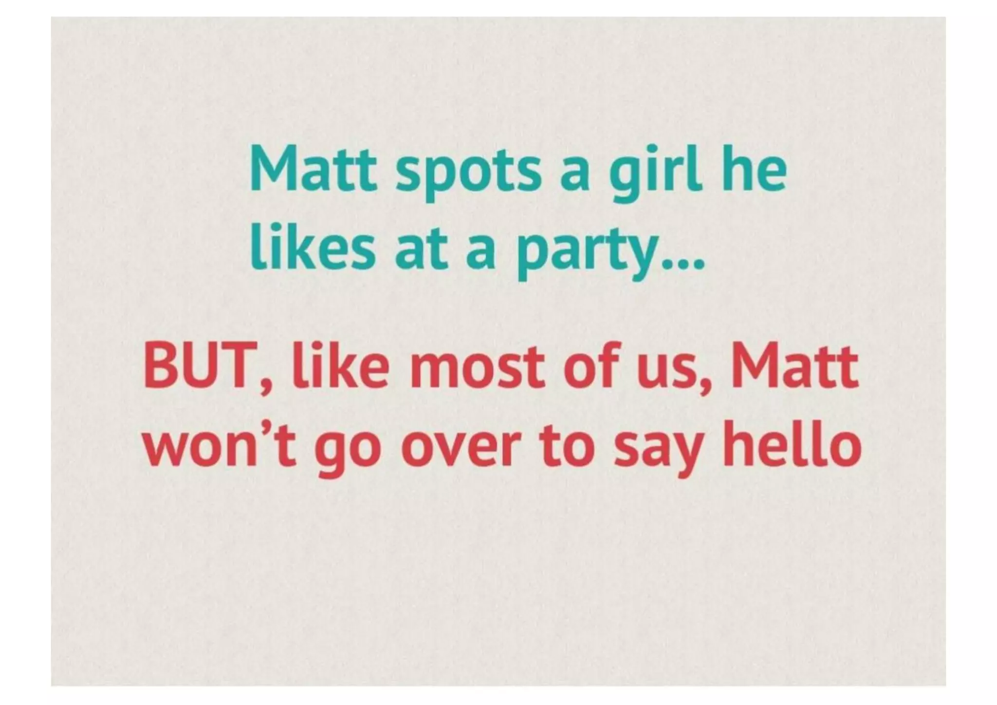
The opening slide (Match Box — the flirting game...) uses a simple, friendly brand lockup and a short tagline. This establishes tone immediately: playful, social, and product-led. The visual restraint (large logo, neutral background) focuses attention on the name and the concept rather than distracting the audience with dense text.

For founders, this demonstrates the value of starting with a concise brand and tagline that signal what the product is and who it’s for. A strong opening slide sets expectations and makes subsequent narrative elements easier to follow because the audience already understands the domain and intent.

Key Takeaway: Lead with a clear brand and a one-line tagline that communicates the product’s promise and tone instantly.
User story: Personifying the problem (Meet Matt)

User story: Personifying the problem (Meet Matt)

The 'Meet Matt' slide uses a single relatable character to humanize the problem. Showing a real person (photo + name) helps investors empathize: it’s not abstract market speak but a specific moment and behavior. That makes the problem feel tangible and emotionally resonant — key for consumer social products where human behavior drives adoption.

Founders can learn to use short, narrative user vignettes early in a pitch to anchor the product story. A quick persona + context allows the audience to grasp use cases without lengthy market analysis and primes them for the product-as-cure framing that follows.

Key Takeaway: Use one relatable persona and a short scenario to make the user problem visceral and memorable.
The Problem: Fear of rejection and social friction

The Problem: Fear of rejection and social friction

This slide bluntly names the core emotional barrier — 'FEAR OF REJECTION' — in large, bold type. The pitch doesn’t hide behind euphemism: it calls out the psychological barrier preventing people from acting. That clarity focuses attention on the value proposition: if you can reduce the cost of a potential rejection, you can unlock many missed interactions.

The lesson for founders is to distill the problem to its emotional center when relevant; investors and users respond to problems expressed in human terms. Bold typography and contrast emphasize importance and guide the audience to the right emotional takeaway before introducing the product.

Key Takeaway: Clearly name the emotional or behavioral friction your product removes and emphasize it visually to create urgency.
Solution framing: ’Meet the cure’ and simple onboarding

Solution framing: ’Meet the cure’ and simple onboarding

Slide 5 presents the solution succinctly: a mobile app that reveals mutual likes and uses social graph context (Facebook sign-in) for immediate relevancy. The screenshot-focused approach shows the onboarding affordance (sign in) and hints at the product’s ease-of-use, positioning it as a low-friction alternative to approaching someone in person.

This demonstrates the power of visual product demo in a pitch. Rather than long text descriptions, show the interface and the first user action. For founders, early emphasis on onboarding and the first delightful moment (in this case, seeing mutual interest) communicates that they’ve thought through the initial user experience.

Key Takeaway: Show a real app screen for the first user action (onboarding/first win) to prove the concept and reduce investor uncertainty.
Core product loop: Like / Not and quick matching

Core product loop: Like / Not and quick matching

Slide 6 showcases the core interaction — binary 'Like' or 'Not' decisions wrapped around a profile card that surfaces friends and shared interests. The simplicity of the interaction model is its strength: low cognitive load and immediate feedback. The UI also reinforces trust signals (mutual friends, shared interests) that lower friction and encourage engagement.

Founders should take away that the simpler the decision model, the faster you can scale discovery loops. Visual emphasis on trust signals (social graph, interests) is especially effective for early social products because it increases perceived safety and relevance without complex matching algorithms.

Key Takeaway: Design a single, simple core action that creates instant feedback and pair it with contextual trust signals to increase conversion.
Conversation & retention: Messaging as the outcome

Conversation & retention: Messaging as the outcome

The messaging screen (slide 8) illustrates the product’s intended outcome: a natural conversation between matched users. Showing a real exchange helps the audience imagine real-world value — what success looks like for users. The example also indicates that the product enables immediate, private dialog only after mutual consent, which reinforces safety and reduces spam.

For founders, it’s important to visualize not only acquisition but the retention moment — the first task that indicates the user has received value. A screenshot of messaging or the first meaningful action demonstrates that the product flow doesn’t just create matches but facilitates real interactions.

Key Takeaway: Include a concrete example of the retention moment (e.g., chat after match) to show the product’s real user value and lifecycle.
Business model: Signals, tech and monetization

Business model: Signals, tech and monetization

The revenue and technical slides (e.g., under-the-hood and in-app purchases) concisely list differentiators (hyper-location via Wi‑Fi, mutual liking, social signals) and direct monetization ideas (pay to see more matches, virtual gifts, boosted placement). Presenting both the technical defensibility and monetization together communicates a pathway from product to profitable unit economics.

Founders should emulate this pairing: explain key product signals or proprietary data that give you relevance and defensibility, then directly connect those signals to realistic revenue streams. Clear, prioritized revenue bullets make it easier for investors to understand scalability and payback assumptions without a lengthy financial model.

Key Takeaway: Link your technical advantages to specific monetization levers so investors can see how product signals translate into revenue.

Conclusion: Key Lessons

This deck is effective because it follows a tight narrative arc: brand → user persona → problem → product solution → core loop → evidence of outcomes → monetization and tech differentiators. Slides are visual and focused; they use persona storytelling, real UI screenshots, and clear bullets to reduce ambiguity. Founders should note the disciplined economy of words and the emphasis on showing rather than telling — product screenshots and example conversations convey value far faster than abstract claims.

Actionable advice: open with a clear tagline, anchor the story in a relatable user, show the first product win (onboarding to the immediate benefit), visualize the retention moment, and explicitly map defensibility to monetization. Keep slides simple, use visuals to prove the product works, and make the revenue logic obvious — that combination makes a compelling seed pitch for consumer apps.